
The OtheR Pandemic


If anyone has been reading my writing you might have accurately guessed that I am a big fan of the second-most thing. I want to hear the seldom-told story of the silver medalist. First place gets enough press, and everyone loves an underdog.

I am writing this post to help people with a second, silent pandemic that our busy healthcare professionals aren't able to directly address. I have volunteered to do so in their stead:
The undocumented epidemiologist
I'm not big on social media, but like anyone with a developed sense of schadenfreude, I enjoy reading Facebook arguments on news articles.
Epidemiology is really hard, but I've noticed this year's explosion (dare I say, of pandemic proportions) of epidemiologists publishing critical data insights on social media. So I have to ask my reader, is it possible you or someone in your home is an undocumented epidemiologist? Our nation needs them off the Facebook comment section, and in the lab.

How to identify an epidemiologist
Epidemiologists study how often diseases occur in different groups of people and why. They evaluate interventions for public health, clinical practice, health services and policy. They usually have Ph.D's or medical degrees (sometimes both) during which they learn about the fundamental biological and physical sciences, and take statistics courses that teach them how to run multiple regressions to evaluate dependent variables (outcome) against independent variables (predictors). A lot of effort is put into identifying, disclosing, and accounting for all possible sources of bias and chance (there's even a discipline of epidemiology dedicated to the practice).
The three major types of studies epidemiologists run regression tests on are:
- Cohort studies (people exposed to a risk factor VS people not exposed to that risk factor; useful for finding standardized incidence and mortality ratios for comparison against the general population)
- Case-control studies (diseased person VS healthy control; useful for finding odds ratio)
- Cross-sectional studies (defined population sampled at a single time-point; multivariate analysis)
Some high-level examples of what might be considered when evaluating the incidence and causes of something like breast cancer:

| Type of target parameter | Effect estimate | Examples | Model or type of calculation |
| Comparison within the study population (internal comparison) | |||
| Dichotomous | Odds ratio, Relative risk | Breast cancer (yes/no) | Two by two table |
| Dichotomous | Odds ratio | Breast cancer (yes/no) | Logistic regression |
| Time to first event | Hazard ratio | Time to death, Time to recurrence, Time to disease | Cox regression |
| Rare events | Relative risk | Number of breast cancer cases | Poisson regression |
| Comparison of the study population with the general population (external comparison) | |||
| Dichotomous | Standardized incidence ratio, Standardized mortality ratio | Breast cancer (yes/no) | Age standardization |
That's a really narrow, cursory view of professional epidemiology, and nothing new or difficult to understand for any seasoned keyboard-wielding public health expert.
I don't trust the government, I'll be my own epidemiologist
Of course, no one should force you to accept any paradigms, so you're free to do your own analysis and ignore all the bullshit mainstream epidemiologists subscribe to, and their mouthpiece health officials that relay complicated data to us ordinary citizens.
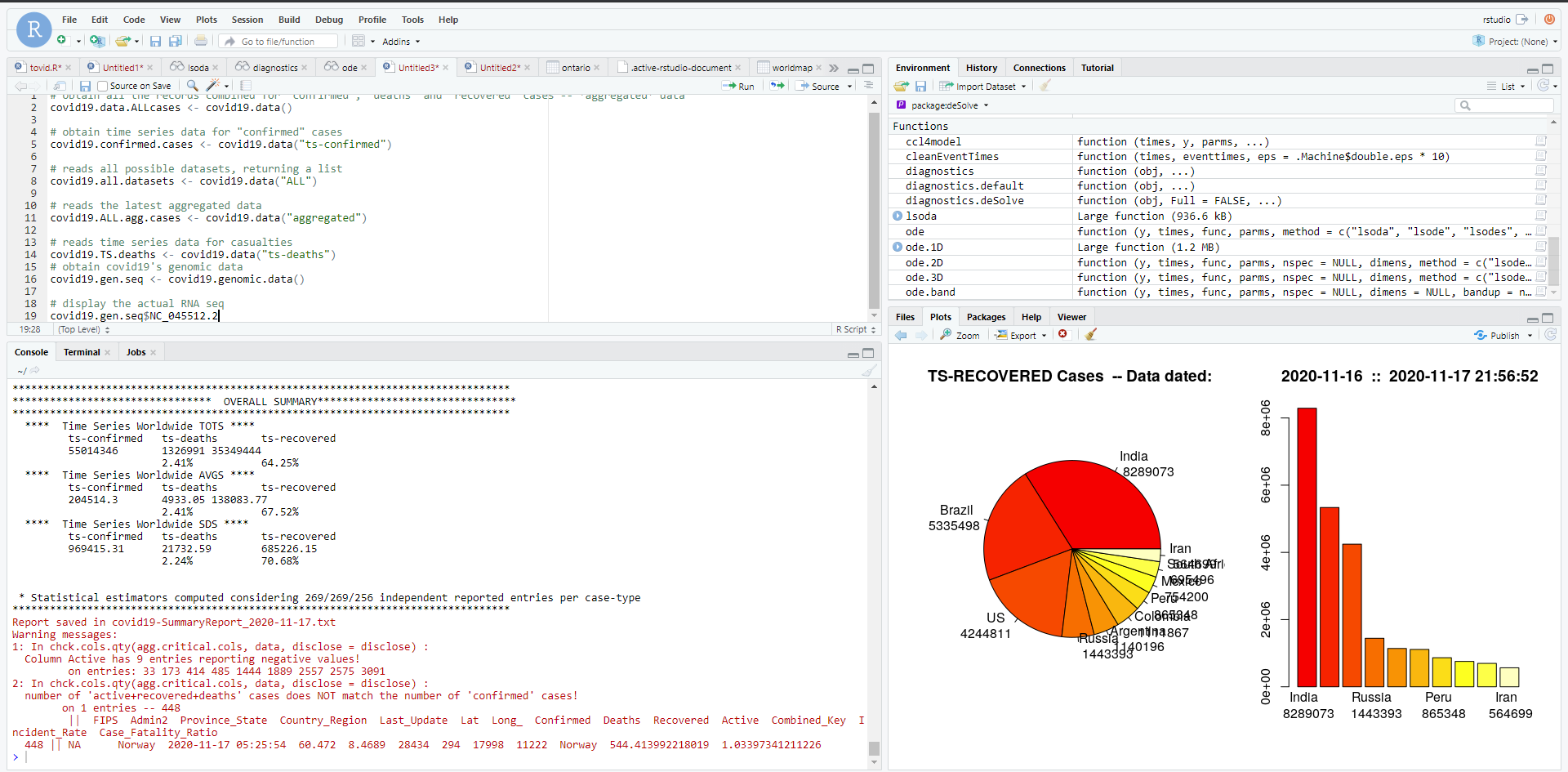
Toronto hosts a variety of easily-accessible data on https://open.toronto.ca/ which even includes the raw COVID data people are asking for on every single comment section! It's available in many formats, for your analyzing pleasure. I got a really low A- in a statistics course a billion years ago, so I decided to try my hand at offering an alternative COVID analysis.

DIY
Using a programming language called R we can pull out all sorts of various statistical manipulations that I have 0 clue how to apply.
Using publicly available data for Ontario, here are two visualizations of one SIR model (susceptible-infected-recovered) for the province that I generated. This shows you how the same set of data (two charts on the left VS two charts on the right) can be presented visually to suggest a dramatic recovery, or no recovery at all. Really, only the Y axis scale is manipulated between the two sets:
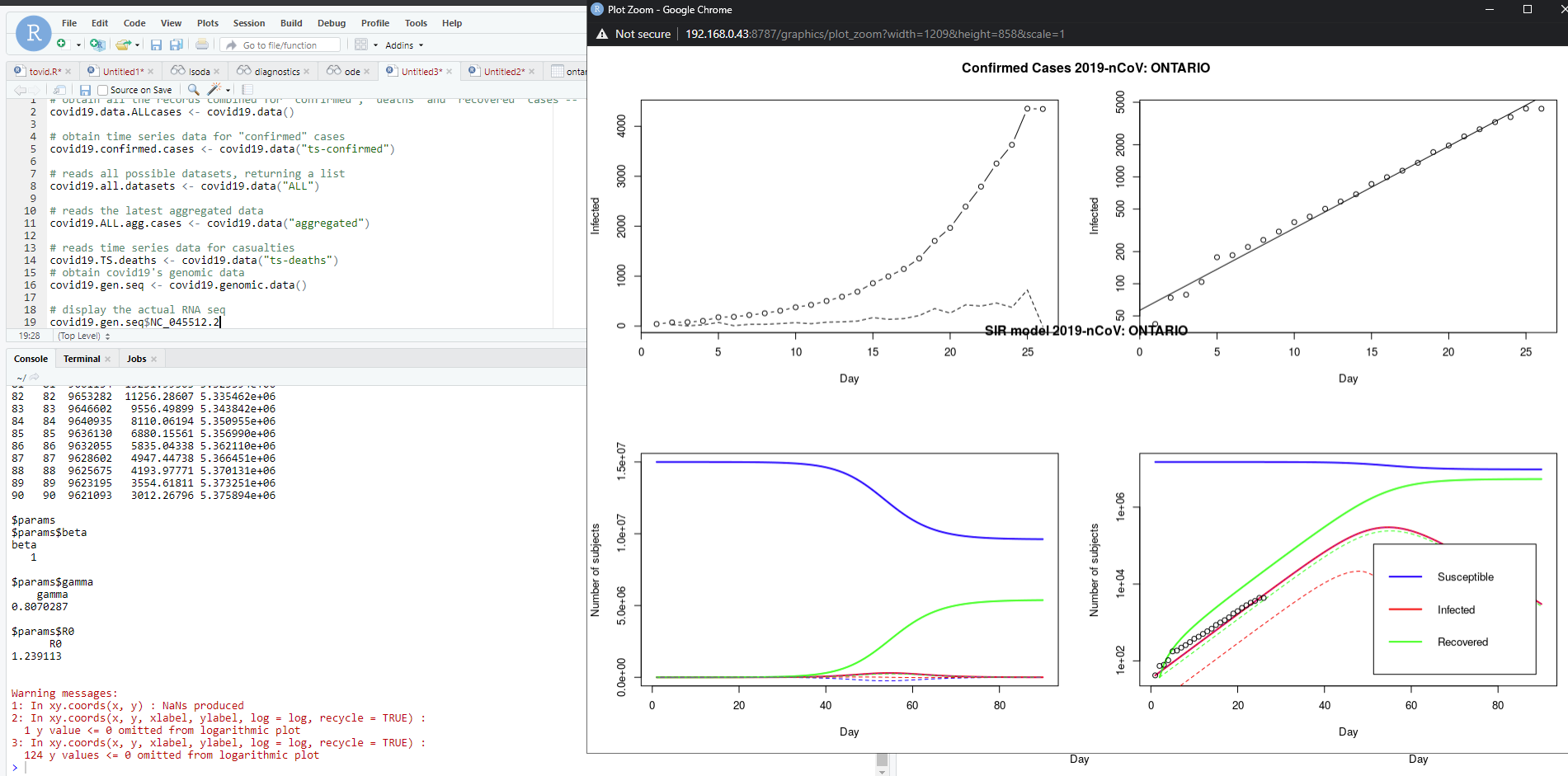
This tells me nothing, of course, because I have no idea how to interpret raw or even arbitrarily analyzed statistical data. I don't even know how to apply an analysis because of the sheer volume and variety of data that was put together to make this model.
Take the idiot's way out
I don't really care about Facebook comments, but I do think (real) epidemiologists in Canada do an incredibly difficult job, incredibly well. I'm obviously unable to do the data analysis myself.

I will continue to take the dumb person's path, and let the institutions of society do the heavy lifting for me. All I can do is read the daily/weekly epidemiological summaries (I don't), and listen to the updates based on them (I do). If I could do a better job myself, I would. But I can't.
I am not an undocumented epidemiologist.